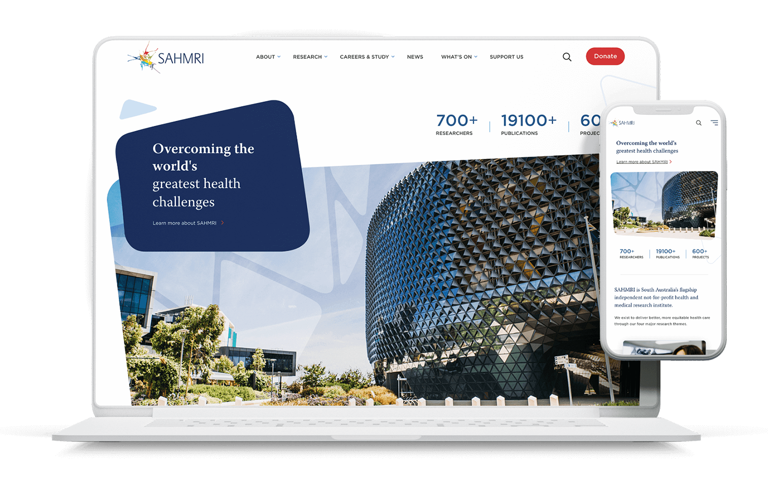
SAHMRI endeavours to overcome the world’s greatest health challenges and make research more transparent and accessible for the community. The redeveloped website showcases this through a modern, crisp design underpinned by a comprehensive content strategy.
The SAHMRI website is a showcase of the vital research work being undertaken at the world-class facility. Information is logically organised and structured, with content relationships easy to understand and information easy to digest. Thanks to an iterative, consultative design approach, the site caters to researchers, donors and the general public all in one, with easy navigation pathways for each user group.
As a world-class research facility, SAHMRI’s purpose is to not only showcase the innovative research being undertaken on-site, but also attract researchers from all over the world, raise funds for their vital research and raise awareness about their vital work. With the SAHMRI project team, we explored what success looks like, and how we might gear the project towards achieving these goals.
Goals included:
Their two existing websites took a ‘divide and conquer’ approach to achieving these goals: one site was geared towards the research and scientific side, and one was a brochure-style site for general awareness and seeking donations. There were multiple cross-overs and commonalities between the two, with users often hopping between both to find the information they are seeking. The SAHMRI team found this often hindered and splintered their efforts. In order to better align their goals with their customers’ needs, and have content that caters to all three user groups, we decided that merging the two sites into one would provide a better, consolidated user experience.
The SAHMRI team had a wealth of information about their key stakeholders and user groups, which assisted our UX strategists in formulating an extensive, cohesive content strategy.
First, our team reviewed heat maps and behavioural analytics from SAHMRI’s existing sites to uncover user pain points and establish areas that required further exploration. From this, we conducted in-person interviews with SAHMRI’s website users to understand their needs, blockers and mental modes. This included researchers, students, media, staff members, donors and the general public, providing our team with a broad yet robust understanding of how people used the sites and what they were looking for.
We created a card-sort exercise using the current content, in order to discover how people understand and categorise information. This was also used to understand how people might label a group of information.
Using insights from user interviews, desk-based research and card sort results, our team compiled a navigation structure, ready for testing. This testing helped us to both validate and trouble-shoot the findability of the topics within the IA. After evaluation and iteration, an improved navigation structure was tested with a new audience in order to avoid biases from the previous test. This final IA had a 88% task success rate: out of all of the tasks completed by participants, 88% of users ended up at a “correct” answer.
In line with the IA compilation, our content strategists performed a thorough audit and analysis of the two existing websites, creating a repository and source of truth for any content movement. The IA was also cross-referenced with keyword research and validation, ensuring that the refreshed site was set up for success with search engines and users alike. This keyword research also uncovered gaps and opportunities for the SAHMRI team to expand their content offering.
Before the website design starting taking shape, our focus was on the interpretation and visual representation of the SAHMRI brand through digital art direction. This art direction gave life to the brand guidelines, creating a holistic brand communication approach across digital platforms.
Our designer took cues from both the colourful SAHMRI logo and brand guidelines as well as the smooth curved shape of the SAHMRI building itself. We were also conscious of accessibility, selecting colours and fonts that were easy to read and helped to accentuate and emphasise, rather than distract. Through the curved shapes, the website emulates the look and feel of the iconic building, a landmark site in the heart of Adelaide.
Highlights of the redeveloped site include:
Our strategy team are happy to help.
© 2022 Atomix web & creative studio